Using the LIFT model for conversion rate optimisation
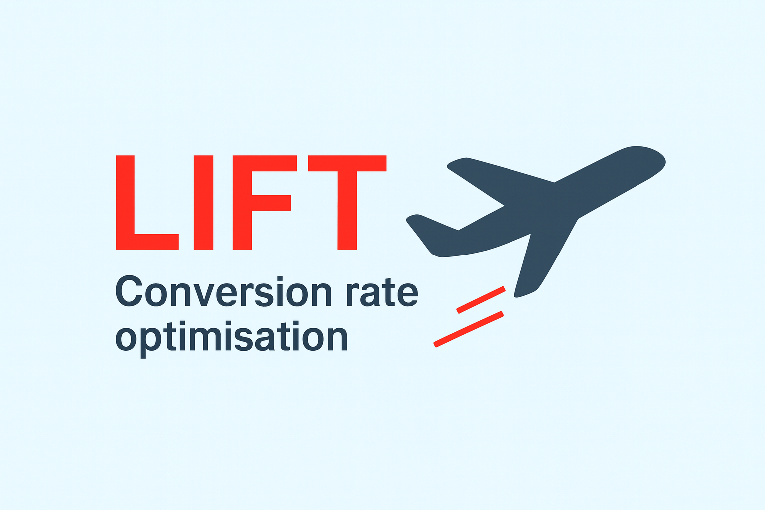
If you're looking for a conversion rate optimisation framework that's practical and genuinely useful, the LIFT model is worth considering.
It was developed by Chris Goward back in 2009, and is championed by CRO specialist agency, Conversion. It's remained relevant because it focuses on the fundamentals of what makes people convert.
What is LIFT?
LIFT stands for Landing page Influence Function for Tests. It's a bit of a mouthful, I know, but don't let the name put you off - the framework itself is straightforward and effective.
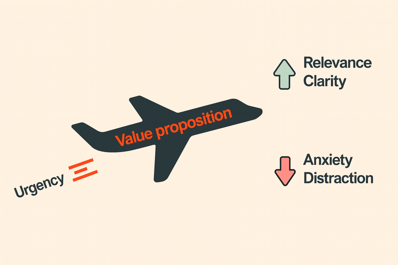
While it was originally designed for landing pages, the LIFT model can be applied to any digital conversion journey. It centres on six factors that influence conversion:
Value proposition
Relevance
Clarity
Urgency
Anxiety
Distraction
In this post, I'll walk through how to apply the framework, focussing on each of these six areas, and how it can help lift conversion rates across your digital content, journeys, and experiences.
Value proposition
Your value proposition is the most important of the six factors. It's essentially your unique selling point - the reason someone should choose you over your competitors. It's what makes you stand out.
The more persuasive and compelling your value proposition, the higher the likelihood of converting visitors. If you don't communicate it effectively, your users will go elsewhere.
A value proposition can relate to your company as a whole, or to a specific product you're offering. So take a look at where users are landing on your site or app, and see if your value proposition is clear and compelling. If it isn't, you're missing out on conversions.
Your value proposition should clearly communicate the benefits of using you or your product. Those perceived benefits need to outweigh the perceived costs, so your users feel motivated to act. The stronger your value proposition, the greater your potential conversion rate.
Relevance
Relevance is about understanding how and why people are reaching you, and whether your content aligns with their expectations and intent.
For example, if someone arrives on your site having seen an advertisement for 10% off, but that offer isn't clearly communicated on your landing page, you've lost relevance - and with it, your chances of converting that user. This mismatch between expectation and reality can lead to a loss of potential customers.
Or let's say you have a website that sells insurance, and you're bidding on keywords like 'cheap car insurance.' But your landing page does nothing to explain how your car insurance could potentially cost less than other providers. In that case, you might as well stop advertising on that keyword now, because users are going to disappear when they find your content irrelevant.
If a user lands on your site or app, expecting certain things, and you don't deliver, they're going to leave. And that means a higher abandonment rate and lower conversion rate.
Clarity
Clarity is all about making sure the content a user is interacting with - from the landing screen through to the conversion journey - is clear and understandable.
This isn't just about the information you provide. It's also about the design and layout. Are your landing screens and journeys clear and concise, and easy to follow?
Do you use content that helps users understand what you're offering? That could be video explainers, visuals, or interactive content and tools.
Having worked a lot of my career in financial services, offering clarity has been key when trying to engage and convert users. Financial products can sometimes be hard for people to understand, so it's important to use simple language rather than technical jargon. Things like financial calculators can help users better understand what you're offering - for example, affordability calculators if you're selling mortgages, or tools that estimate potential returns if you're selling investments.
Content like this paints a clearer picture of what you're offering the customer, and helps them convert.
To enhance clarity, aim for simple, concise language that your target audience can easily understand. Pair this with an intuitive, clean site design and features that guide users smoothly through their journey. That's how you maximise conversion.
Urgency
Urgency is when your users feel that immediate action is needed, and that delaying might result in a missed opportunity. It's a psychological trigger that can be powerful when used well.
There are two types of urgency to think about. Internal urgency is generally pre-existing when someone arrives on your site or app - like when it's a few days before Christmas and they still need to buy presents. You can do little to control internal urgency. But external urgency is something you can control and introduce through offers, deadlines, and tone.
Creating a sense of external urgency can be as straightforward as adding a countdown timer for a sale or offer, or displaying limited stock availability. These cues can motivate people to act now rather than later.
But you need to be careful here. Urgency needs to feel genuine. If visitors sense manipulation, it can backfire and generate mistrust, which will negatively impact your conversion rates rather than improve them.
Anxiety
While increased clarity, relevance, and urgency drive conversion up, anxiety pulls it down. Anxiety relates to any fears, doubts, or hesitations that might prevent a user from completing a desired action. If users feel anxious when interacting with your content, you've killed your chances of converting them.
They might worry about data security when they're being asked to provide personal information. Or they might hesitate before making a purchase due to concerns about product or service quality.
To ease these concerns, build reassurances into your digital content and journeys at crucial stages. Display security logos at checkout to reassure visitors about data safety. Showcase reviews and testimonials from satisfied customers to provide reassurance about the quality of your products and services. These measures can go a long way in alleviating user anxiety and making them more comfortable with converting.
In financial services, for example, reducing anxiety has been a big focus. But working in a regulated industry often means ensuring users understand the regulation and risk around financial products and services. Naturally, messaging like this can be anxiety-inducing. For example, you have to tell people their home may be at risk if they fail to keep up with mortgage payments, or that their investments might go down as well as up. So it can be tricky to focus on reducing anxiety while meeting the regulatory requirement to inform users with the right information. Balance is key here.
Distraction
The final inhibitor to conversion is distraction. Distractions are things on your site or app that divert a user's attention away from your primary conversion goal.
Think about unnecessary pop-ups appearing while a user is trying to make a purchase, or irrelevant links that take users away from the checkout process. Even a confusing layout can act as a distraction.
The key to minimising distractions is having a clear focus on your conversion goal for each stage of the user’s journey. Every element through the journey should support and lead towards that goal. Remove non-essential elements, limit the number of choices or actions a visitor has to take, and guide the user with a clear, linear path toward conversion.
The more visual cues and action options your visitor has to process, the less likely they are to make a conversion decision. By minimising distractions - unnecessary options, links, and extraneous information - you can increase your conversion rate.
Putting the LIFT model to work
The LIFT model gives you a structured way to think about conversion optimisation. Rather than making random changes to your site or app and hoping for improvement, you can systematically evaluate your content and journeys against these six factors.
Start by looking at your most important conversion journeys. How strong is your value proposition? Does your content match user intent? Is everything clear and easy to understand? Have you introduced appropriate urgency without seeming manipulative? What anxieties might users have, and are you addressing them? What distractions could you remove?
Once you've identified the areas that need attention, you can prioritise your optimisation efforts based on where you think you'll see the biggest impact. Test your changes, measure the results, and keep iterating.
That's how you turn a framework like this into actual conversion improvements.